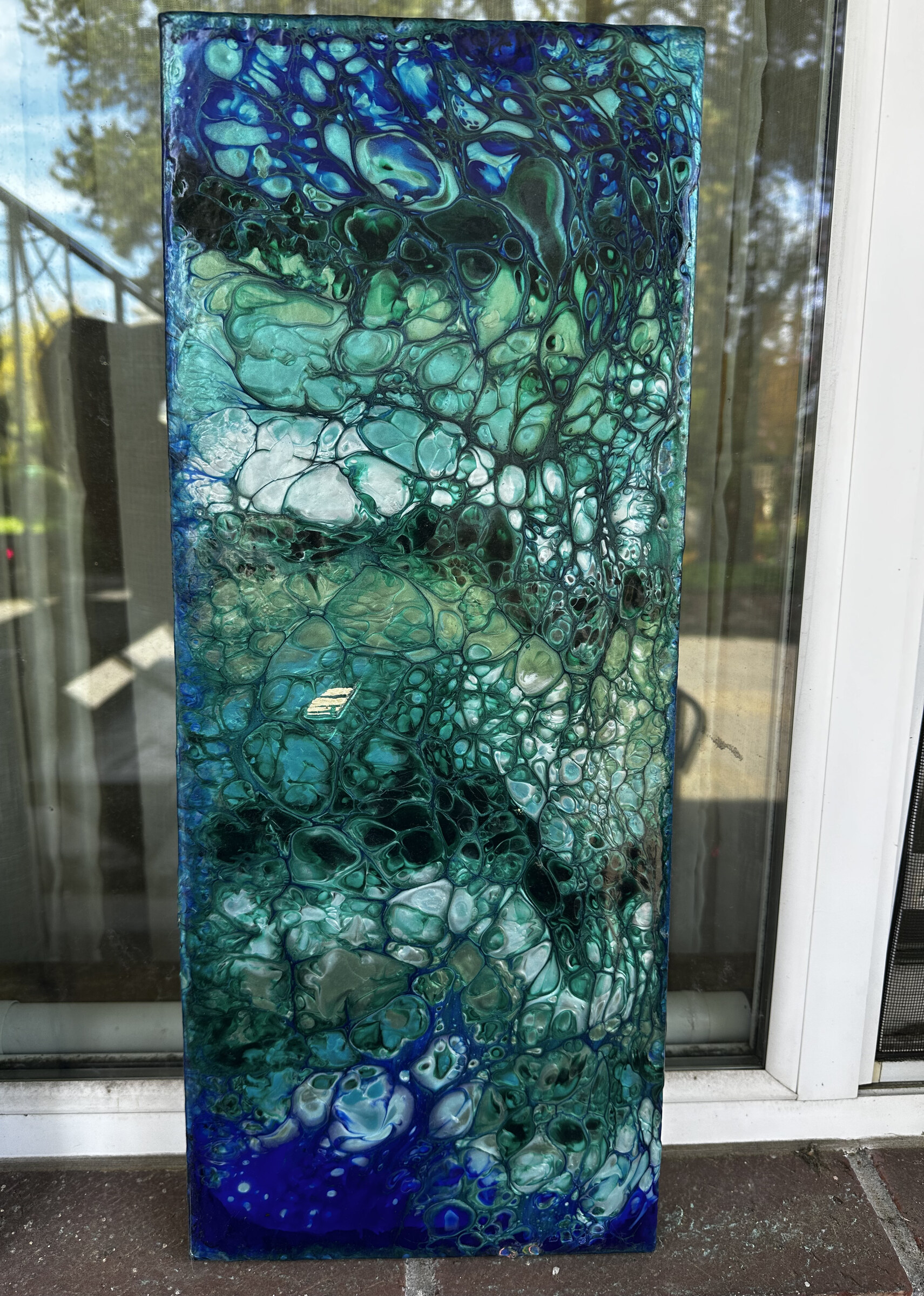
Arteza metallic acrylics · Azteca Ultramarine Blue base · Swipe pour, wet paper towel
Swipe Pour · Arteza Metallics
I had a shower curtain I loved. I decided to make the painting that went with it.
Arteza metallic acrylics · Azteca Ultramarine Blue base · Swipe pour, wet paper towel
The decision
Most paintings start with a surface and an intention. This one started with a shower curtain: midcentury modern geometric shapes, a specific color story of teal and cobalt and green that I kept coming back to. I didn’t want to copy it. I wanted to make something that lived in the same visual space. Something that would read as a response from across the room.
The color match was deliberate. Azteca Ultramarine Blue as the base, the same non-metallic ultramarine from the Bioluminescent pour, same formula of water and Liquitex pouring medium, but less water here. Thicker paint produces larger cells, and I wanted structure in this one.
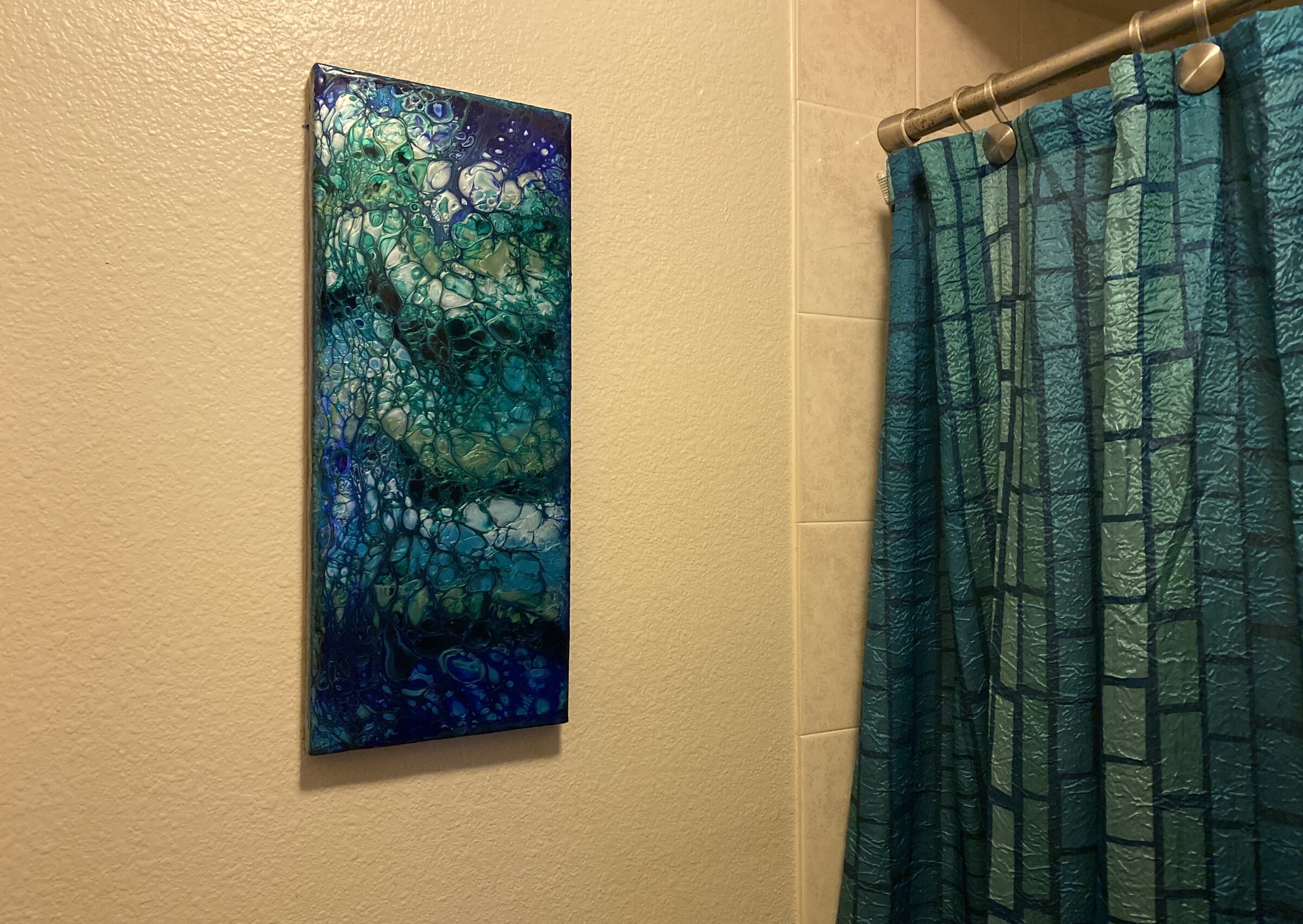
The painting installed beside the curtain that started it. They read the same from across the room.
The swipe
A swipe pour works differently from a Dutch pour. Instead of using air to move the paint, you use a physical tool, something that drags across the wet surface. I pooled lines of color directly on top of the wet ultramarine base. Arteza metallics, not mixed, sitting almost touching. Then swiped each zone once with a three-to-four-inch width of wet paper towel. Once only, to preserve the structure of each line.
The wet paper towel absorbs as it moves. It picks up ultramarine from the base and carries it into the path. That’s what gives the leading edge its softness. The cells open in a long, directional opening rather than the radial burst you get from air.
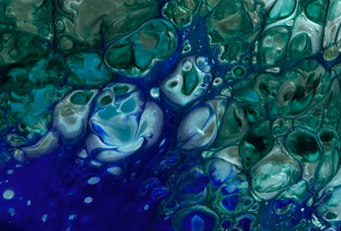
The leading edge of a swipe: ultramarine carried into the metallic layer, cells opening along the direction of movement.
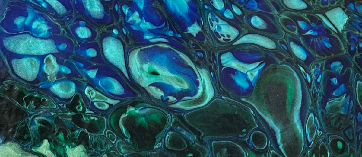
Directional cells versus radial: the swipe keeps everything oriented. Air would have scattered this.
The geometry
The shower curtain has vertical organization, with shapes arranged in zones, each with its own color logic, reading as a whole from a distance. The pooled lines ran vertically. The swipe moved with them, not across them. The Ultramarine Blue shows at the top and bottom of the canvas, the base color exposed where the swipe passed.
The canvas hangs vertically to match the curtain’s proportions. They don’t match exactly, but they’re in conversation. That’s the point of “across the room”: not identical, but unmistakably related.
They don’t match exactly, but they’re in conversation. That’s the point of “across the room.”
Technical notes